
Graphical Syllabus: Redesigning Course Information for Students
A student-entered syllabus redesign that organizes essential course information into a clear, visual format that is easier to navigate and understand.
Role
Designer

Tools
Canva

Deliverable
Graphical Syllabus

Audience
Introductory neuroscience students

Challenge
Traditional syllabi are often dense, text-heavy documents that can feel overwhelming for students. Important information such as assignment deadlines, grading requirements, course expectations, and instructor availability can be difficult to find quickly, which may limit how often students use the syllabus throughout the semester.
Goal
Create a graphical syllabus that complements the traditional course syllabus by making essential information easier to find and understand. The design highlights key course details, including course structure, grading breakdown, important dates, class and office-hour times, and instructor information, so students can refer back to it throughout the semester.
Optional Next Steps:
If this graphical syllabus were implemented in a course, I would gather student feedback to better understand which elements they found most useful and whether the resource helped them stay on track, locate course information more quickly, and better understand course expectations.
I would also adapt the graphical syllabus based on the needs of each individual course. Depending on the course structure, additional information could include expectations for discussion participation, technology or AI-use policies, assignment workflows, or other course-specific policies that students may need to reference frequently.
Approach
Designed in Canva using bright colors, icons, graphics, and clear visual organization to break dense course information into smaller, easy-to-scan sections.
Key Features:
Clear visual hierarchy
Grading pie chart
Weekly course structure
Color-coded calendar with text labels
Student support/resources
Accessibility-conscious use of color.
What You Created
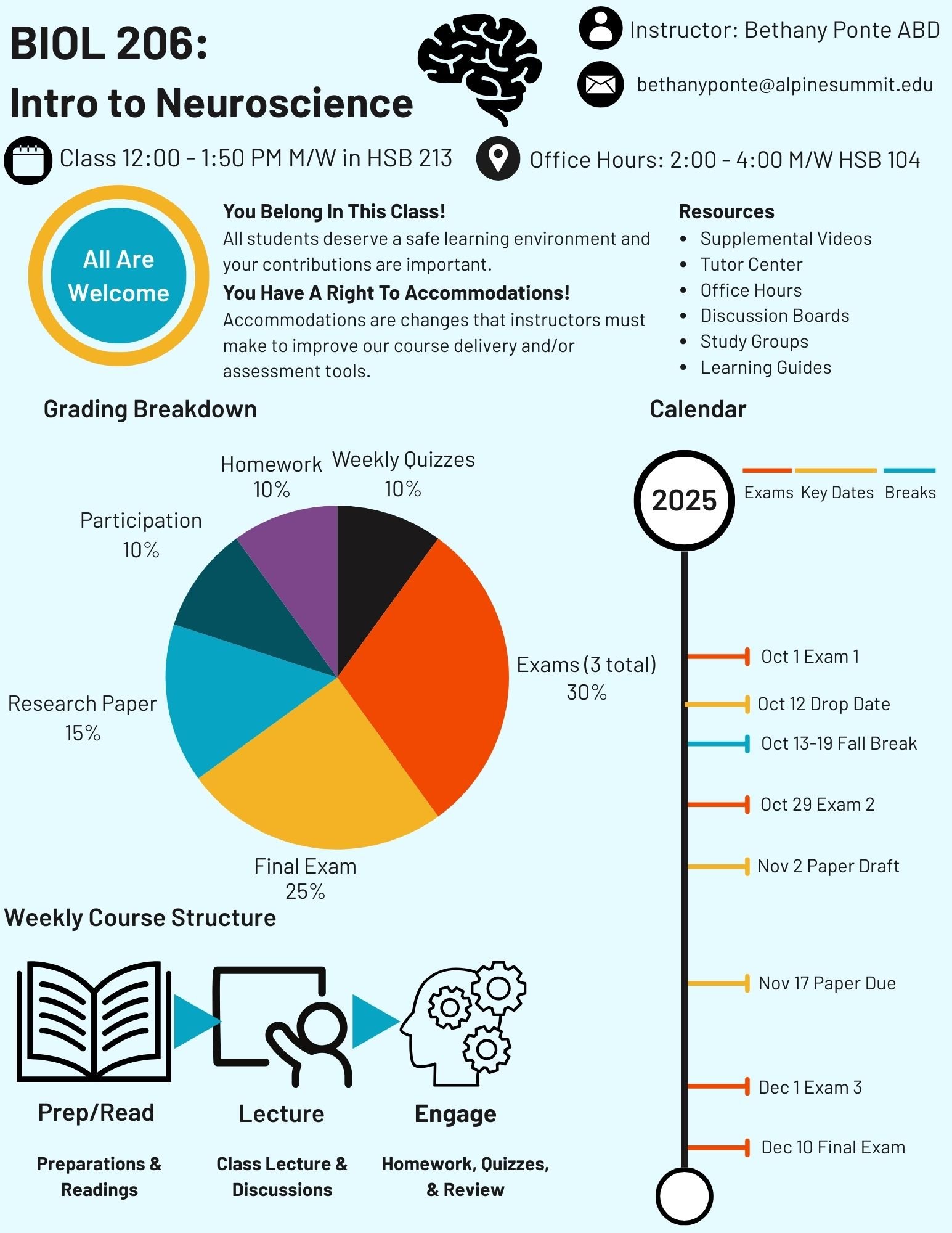
A graphical syllabus designed to accompany a traditional syllabus and provide students with a concise, visually engaging reference for essential course information.
I wanted the graphical syllabus to feel visually distinct from a traditional text-heavy syllabus while still keeping the most important information easy to find. Course title, instructor information, and class details are placed prominently at the top of the page in large, high-contrast text so students can quickly locate essential information.
I also wanted the document to communicate that the course is a welcoming and supportive learning environment. A dedicated section highlights accommodations, student support, and resources that may help students succeed throughout the semester.
Because grading information is often difficult to interpret quickly, I included both written grading information and a pie chart showing how each component contributes to the final course grade. This gives students both a numerical and visual way to understand where their points come from and which assignments carry the most weight.
The syllabus also includes a weekly course structure so students can see the general rhythm of the class without having to identify the pattern on their own. A color-coded calendar highlights exams, important dates, and academic breaks. To ensure that information is not communicated through color alone, each event is also clearly labeled so the calendar remains understandable for students with color-vision differences.
Overall, my goal was to reduce uncertainty. Students should be able to understand what the course will look like, what will be expected of them, where to find support, and how they will be evaluated before they are surprised by any of those elements later in the semester.